.jpg)
Eric Reyna
Case Studies
Other Works
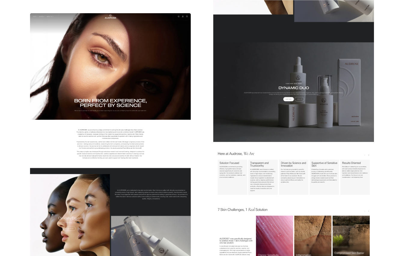
- Custom Product Photography shot in-house to align with rebranded website.
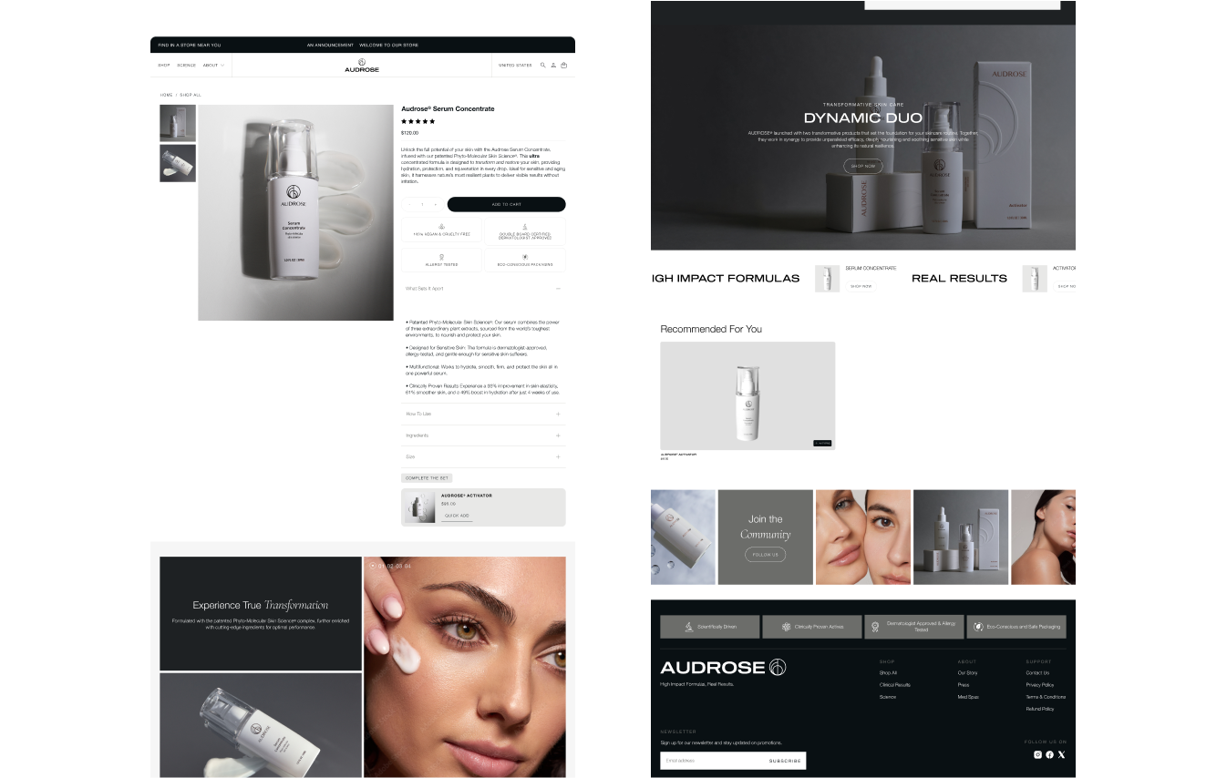
- Product Detail Page optimized to show the interrelated product offering.
- Unique imagery to align with the clinical-forward branding of product line.
- Aesthetic appeal to communicate benefits of complex ingredients.
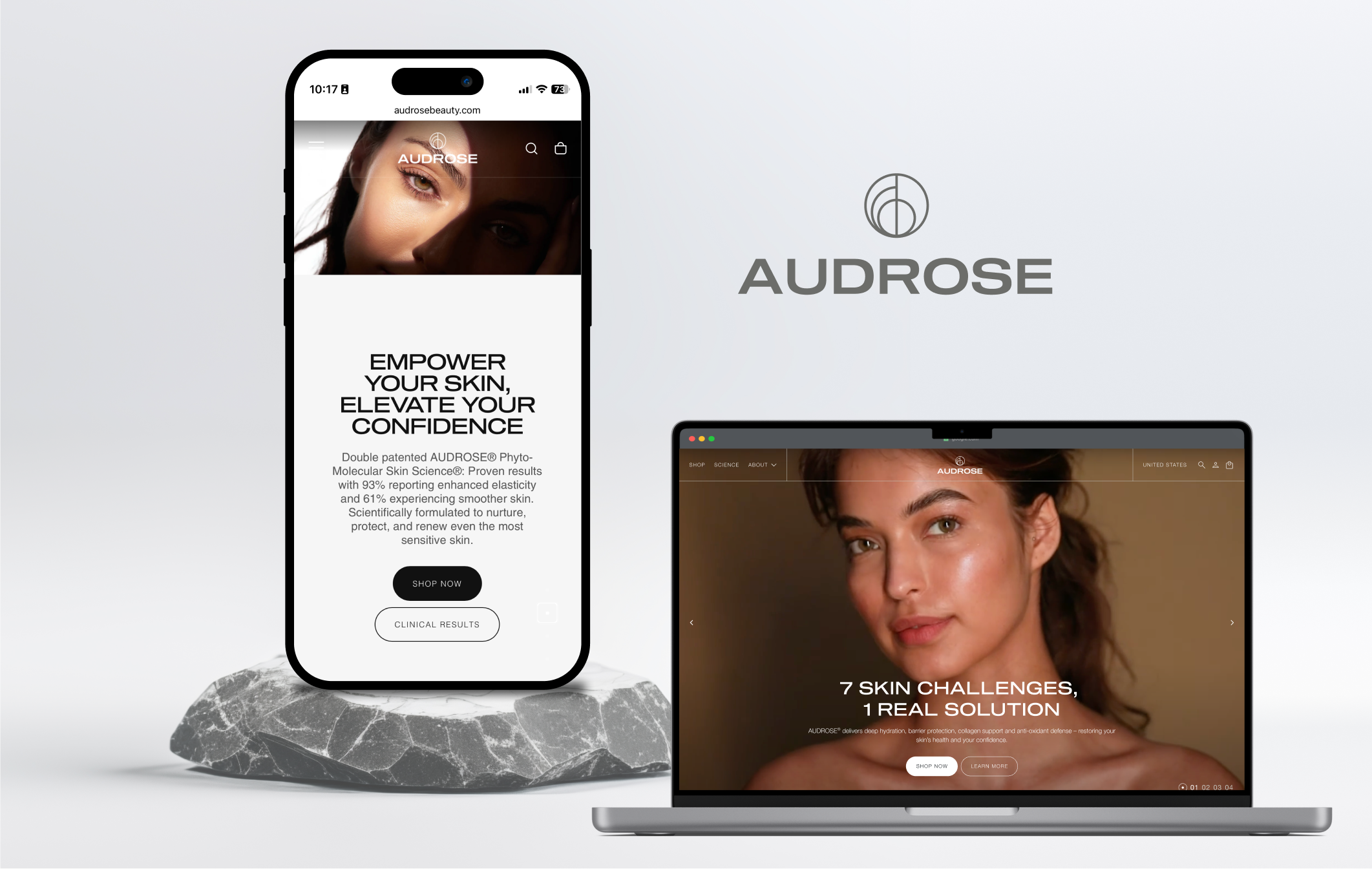
With my design partner from æthos design co, Alejandra, we rigged a makeshift studio in my backyard and kitchen to shoot high quality product images for the website and socials. We directed the shoot with a focus on grey tones and light and shadow play provided an anchor for the imagery to align with the greyscale of the upcoming product packaging.

The language within the website, and more specifically, the product detail pages, was optimized to land with the ideal consumer. Hitting all the SEO best practices – good UX, accessibility, and clear messaging – we led users to a checkout faster and at a higher rate than previous design.
Additionally, the product with the most amount of inventory was able to be packaged and presented together as a 'Dynamic Duo' which we highlighted throughout the site.
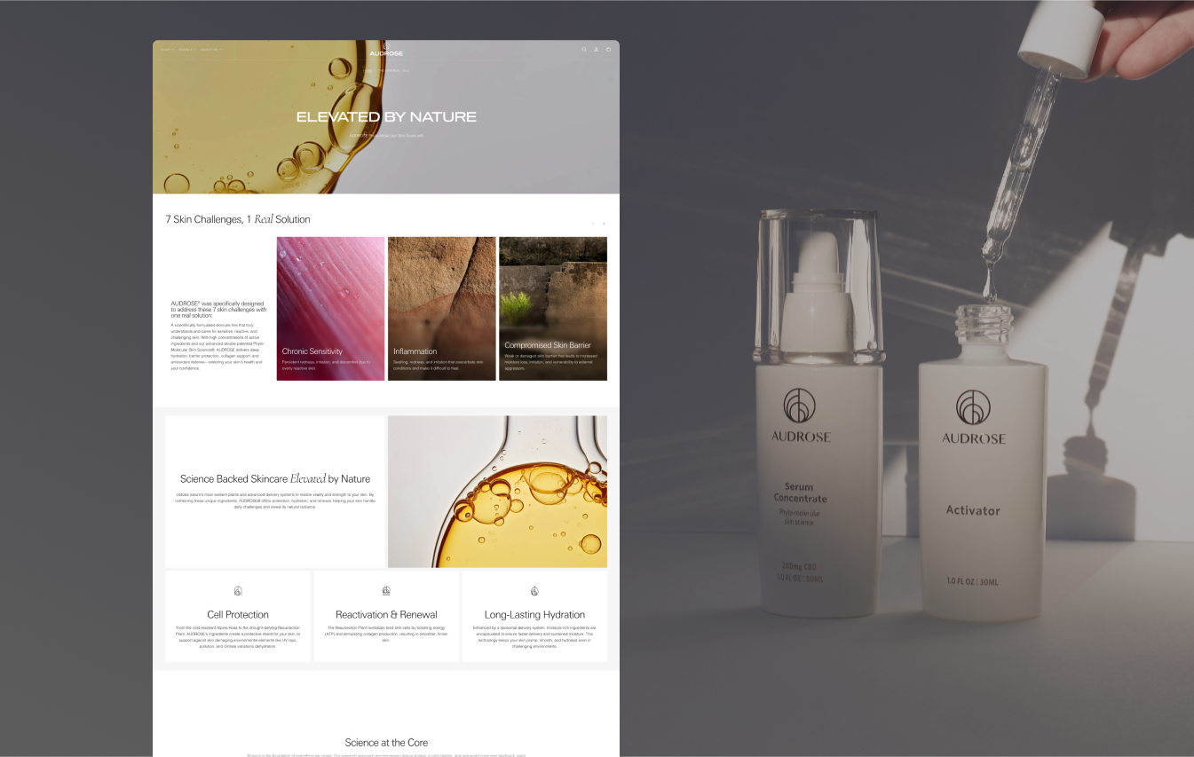
An additional page was designed for the sake of communicating the high quality ingredients in the double patented formulas. This was a strategic design that communicated the complex elements of the product while opening up surface area for SEO.
The About Us page was redesigned with a focus on the brand, rather than the founder. This move was implemented as the founder wanted to scale through a product-led brand as opposed to being founder-led.
Imagery here can be seen as a continuation of the shadow-play that ties into the new branding.
Branding at the sacrifice of sales has been commonplace among the 'vibes' led design movement. This makes sense as E-commerce websites that do more than show and sell products, but communicate the brand and lifestyle are what resonate most with users.
I have learned that striking the balance between the fluffiness of effective branding to build customer trust and loyalty along with more concrete business goals like sales and page views is a challenge, but working iteratively and cross functionally with stakeholders is the only way it can happen.